Should we control how our customers navigate our garden centres in the same way that our webmasters do in our online stores?
Most households have internet or smart phone technology available to them these days. We can’t fail to notice we are in the era of ‘bricks and clicks’ retailing. There is constant pressure to improve our social media interaction with customers to satisfy their expectations, to keep up with competitors and to generally be ahead of the game.
Being ahead with technology introduces further pressure to ensure we meet and maximise the customers experience and presence in store. If we give customers a fantastic ‘clicks’ experience, then it’s in our interest to give them a fantastic ‘bricks’ experience if we want to maintain a healthy cash flow and a reputation for being a ‘best in town’ garden centre.
We ask our webmasters to build an online store that is easy to navigate, easy for people to find your full range of products and information; clearly display your best offers and is appealing and interesting enough to hold their attention before they jump off to continue their surfing.
Should we control what they do in store in the same way as we do online?
Over recent months I’ve found myself standing in garden centres and watching how customers navigate a store, what they do and don’t see, their level of potential experiences and enjoyment, and their satisfaction at finding what they want.
I’ve noticed people walk out of a store empty-handed, or walk just inside the entrance, pick up a 6-pack of seedlings, walk to the checkout to purchase, and walk out of the store. Does this happen in your store?
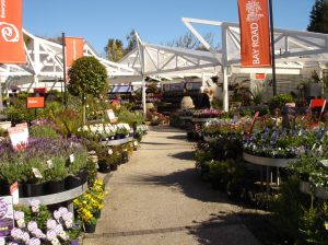
 Wide paths or ‘walks’‘ and allees have been used by landscapers for centuries to control the way people walk through gardens to easily see everything, notice beauty; special design elements; focal points and enjoy the waft of floral perfume.
Smart retailers use the same technique to ensure their customers see the whole of their garden centre, notice specials, notice ideas, find what they want, encourage impulse buys and enjoy the experience - so they tell their friends - and the retailer reaps the benefit of increasing sales and customer numbers. Yes, absolutely you should control where customers walk!
Create your ‘Great Walk’. Take your customers on a pre-determined route and minimise the opportunity for them to take alternative routes or short-cuts. You don’t want them to miss anything!
Provide them with a wide, paved, main pathway that is easy to stroll along on and leads them within viewing proximity of all categories.
If you want your customers to believe you are ‘best in town,” be smart and provide them with the experience, information and value along your main path in the same way as you lead them through your website - and vice versa.

Locate the product most people come to your store for – bedding plants/vege seedlings and cafes - away from the entrance, towards the back of the under-cover or the back of the plant area. Allow them to see everything.
Allow them to experience the most attractive gift displays and garden ideas along the main path
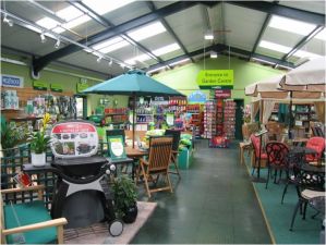
Allow them to soak up your home and outdoor living collections of the latest trends along the main path.
Allow them to see advertised lines along the main path.
Allow them to see popular, seasonal, flowering – the most attractive plants - along the main path.
And the final important ingredient - use signs to communicate, inform, inspire and guide.
- Joy
There's more information about the importance of Layout in our Premises Development Manual
