To be successful retailers requires us to communicate on a variety of levels. How many customers leave your store empty-handed because they couldn't find what they wanted?
How do customers drive? How do they navigate from place to place - many of my friends don’t go anywhere without their Tom Toms or Garmin GPS systems. How do our customers find their way around busy public spaces like airports and train stations?
How do they make the most of their shopping experience in large department stores or malls without the frustration of getting lost and going home empty handed because they can’t find what they are looking for?
There are many ways of communicating with customers these days. To be successful in retail requires us to communicate on a variety of levels:
Externally
Via our websites we communicate our location and contact details; commodity products we have in store or online for sale; new lines; store specials; promotions and events; and we educate by showing people ‘how to’ or by providing information.
We communicate via email newsletters, Facebook and Twitter to update customers with our latest information on what’s happening in store and our latest deals as encouragement to come back and visit.
Some of us pay big money to print and distribute monthly mailers to tell everyone in our neighbourhood or in our town about our sale or the latest seasonal stock in store now
We engage with our community through supporting local events, schools and other community initiatives, to increase the visibility of our business.
In store
We communicate with signs so customers can find their way around and find the product type they are looking for; provide product information, tell what a product does and where it can be used; tell about the services we offer; tell about in-store exclusives and specials, make in-store promotions visible, convey the latest trends in gardening style; encourage customers to choose

gardening as a leisure experience.
Whew! Imagine trying a bricks & mortar store, one of the primary reasons for our external campaigns is to get people into our store, so why confuse them when they arrive.If we have g to share all this information without signs! Staff would be run ragged and they wouldn’t have time to do the most productive things like re-stocking and making product visible so that it will sell.
Many people are time poor. Most feel frustrated and annoyed if they have to spend their valuable time aimlessly wandering a store looking for what they can’t find! They will vote with their feet and walk away without buying - and miss all those impulse opportunities as they do so.
Category signs
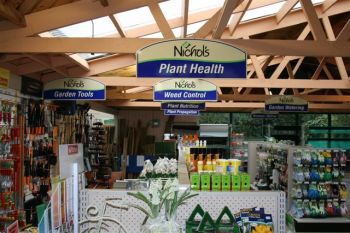
Category signs and sub-category signs are an important tool in assisting customers to find their way around and locate products – especially important for first time customers to your store and to beginner gardeners. They should be in customer friendly language, for example
- Trees: Large Trees, Evergreen Trees, WeepingTtrees, ‘Trees for Small Gardens’.
- Garden care: ‘Plant Food’, ‘Plant Health’, ‘Weed Control’,
- Edible Gardening: Veges, Herbs, Citrus, Fruit trees, Soft fruits
Keep the message and design of category signs simple, clear and with consistent branding.
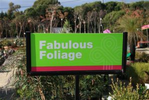
Plants for Purpose or end use signs
 Plants for Purpose or end use signs are sub-categories that make shopping easier for life-stylers, beginners and time poor customers who want to find things quickly. These sign collections of plants for a purpose, situation, colour or style:
Purpose: Ground covers, Screening and privacy, Hedges and edges, Narrow gardens, Plants of Pots, Children’s Gardening, Bird attracting, Fragrant, Plants for Gifts
Situation: Hot & Dry, Shade, Coastal, Clay soils, Windy,
Colour and Style or theme: Tropical, Mediterranean, Formal, Cottage, Simple concepts
Point of Sale Benefit Signs
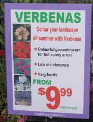
 Point of Sale Benefit Signs promote all the good things about a product and uses these to sell it, taking the focus off the price.
Benefit signs should have an 'end use' heading to attract attention and the benefits or selling points should be in 3-4 bullet points using no more than 10-15 words in total. Use words like ‘Easy Care’, ‘Low Maintenance’, ‘Flower all Summer,’ ‘Beautiful Perfume’, ‘Great in Pots’ Clear concise messages that will appeal to your customers wants and needs. Never use negative phrases or words that make the product sound complicated or hard work!
A5 Bench Talkers are great to draw attention to a product, give reasons to buy – one key message. ‘Take me home to your windowsill’ ‘Lasts longer than a bunch of flowers’.
Smaller A6 Shelf Talkers are excellent to highlight garden care products, especially best sellers customers are looking for or should use; or staff recommendations.
Service and Information Signs
 Highlight just one service at different points around the garden centre – ‘gift wrap’, ‘trolleys’, ‘Umbrellas’ ‘Re-cycle used pots here’
Or use a Service sign in a prominent place, for example behind the checkout to list all the important services that are not obvious – ‘Delivery’ ‘Gift Vouchers’ ‘Garden Design’ ‘Landscaping’ ‘Loyalty Programme’
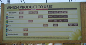
Information signs can highlight what to use, special interest areas, information for unusual plants, seasonal information and so on.
A basic set of integrated signage will engage customers as soon as they enter your store.
It will allow them to find their way around, allow them to read and assimilate information and make the best use of their time, eliminate frustration; convey a message that a visit to your garden centre is stress-free and gardening is fun and an altogether pleasant, rewarding leisure activity.
- Joy Lamb
